Nobody reads evaluation reports. Very few people read the executive summary. What can we do? Evaluation-interested visual designers (like Chris Lysy with his wonderful evaluation cartoons) advocate for visual reports. This week I have done my first visual report and it has been incredibly helpful.
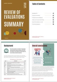
I had written my evaluation report and a reasonably crisp executive summary. I had interspersed the report with a few visuals, designed in Canva. (Huge thanks to the PME Campus for the wonderful course on qualitative visualisation that turned me into a fearless Canva user!) But I still had the impression that a 30-page report would be too long for busy prospective users. Then I designed a couple of infographics, for the conclusions and the recommendations respectively. That exercise was fun, but I had to strip the message to its barest bones to put it into an image that would fit into one report page.
My wonderful client agreed that I could use a couple of days to develop a visual report. It was easier than I had thought – I had my key messages and a few visuals and I had my colour scheme ready and the basic Canva skills it took to adjust a Canva report template. The result was a crisp 7-pager (plus cover pages) with many images, few words and just the right amount of information.
The right amount of information! To turn my findings and recommendations into a visual report, I had to reduce my word count and re-structure every chunk of information. My original summary would not fit into the available space, and I needed to structure every page of the visual report into easily digestible bits. That was incredibly helpful. That was the moment that forced me to really picture the readers and decide what information they needed most. (A design thinking moment!) I am 100% sure this will make my report more useful. And I think I am hooked to visual reporting now.